Web Design Process
When you think about creating a website, it’s not just about picking colors and fonts; there’s a structured web design process behind it all. From the initial consultation to ongoing support, each phase has its own set of crucial tasks. You might wonder how wireframes and prototypes fit in or why client feedback is so essential. And what about testing for usability and compatibility? Each step is meticulously planned to ensure the final product not only meets expectations but also functions seamlessly. Curious about how this all ties together? Let’s explore each phase in detail, especially if you are looking for a web design service in Brisbane, Gold Coast, Sydney or Melbourne.
Initial Consultation and Planning
In the initial consultation and planning stage, you’ll start by understanding the client’s requirements to ensure you’re aligned with their vision. Next, you’ll outline the project scope and timeline to set clear expectations. Finally, you’ll provide a budget estimation to keep the project financially on track.
Understanding Client Requirements
How do you ensure you’re capturing the essence of your client’s vision during the initial consultation and planning phase? First, listen actively. Pay attention to what they’re saying and take detailed notes. Ask open-ended questions to encourage them to share more about their goals and preferences. What do they want their website to achieve? Who is their target audience? These insights will guide your design choices.
Next, review their existing materials. If they have a current website, brochures, or brand guidelines, go through them to understand their style and messaging. This helps you create a design that aligns with their brand identity.
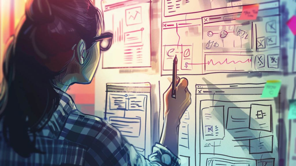
Sketch initial ideas and share them early. Visual aids can help clients articulate what they like or dislike, making revisions easier down the line. Incorporate their feedback promptly to show you value their input.
Project Scope and Timeline
Defining the project scope and timeline during the initial consultation ensures everyone understands the expectations and deadlines. You’ll start by outlining what the project will include, such as the number of pages, types of content, specific features, and design elements. This step is crucial because it sets the boundaries for what the project will and won’t cover, preventing scope creep later on.
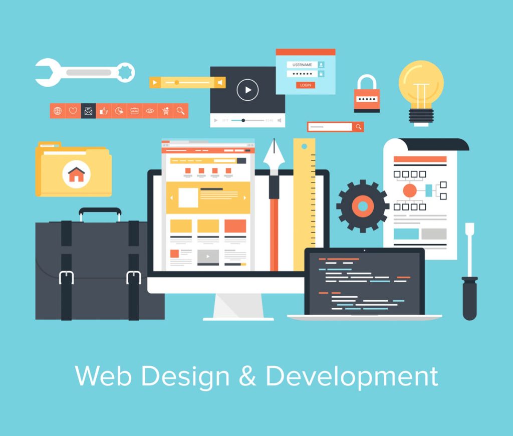
Next, break down the project into manageable phases. Each phase should have clear milestones and deliverables. For example, you might have stages for research, wireframing, design, development, and testing. Assign deadlines to each phase to keep the project on track and ensure timely completion.
During your initial consultation, discuss these phases and deadlines with your client to get their input and agreement. It’s essential that everyone is on the same page to avoid misunderstandings later. Be transparent about what’s realistic within the given timeframe and resource constraints.
Budget Estimation
After establishing the project scope and timeline, the next step is to tackle budget estimation to ensure the project aligns with your client’s financial expectations. This stage is crucial because it sets the groundwork for the entire project. You don’t want any surprises down the line, so it’s essential to get a clear understanding of the client’s budget constraints early on.
During the initial consultation and planning phase, you’ll need to consider various factors to create an accurate budget estimate. Here are some key aspects to focus on:
- Complexity of the Design: More intricate designs require more time and expertise, which can significantly impact the cost.
- Number of Pages: The more pages your website has, the higher the cost will be due to the increased workload.
- Additional Features: Special functionalities like e-commerce capabilities, custom plugins, or interactive elements will add to the overall budget.
Wireframing and Prototyping
Now that your initial plans are set, you’ll start creating wireframes to outline the basic structure of your website. Using various tools and techniques, you’ll build prototypes that represent the site’s functionality and design. This stage is crucial for gathering client feedback and making necessary revisions before moving forward.

Creating Initial Layouts
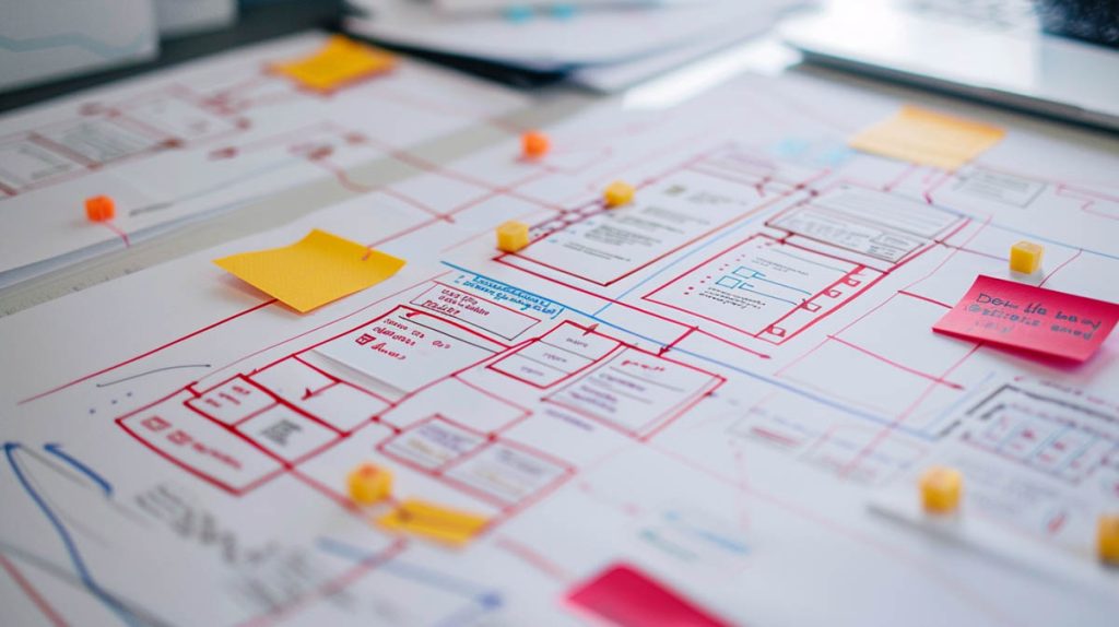
Creating initial layouts through wireframing and prototyping is crucial for visually organizing your website’s structure and functionality. Wireframes are the blueprints of your website, giving you a skeletal framework to plan out the placement of elements like headers, footers, content sections, and navigation menus. Prototyping builds on these wireframes by adding interactivity, allowing you to test user flows and experience the website’s functionality before diving into the detailed design phase.
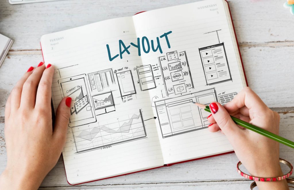
When you’re creating wireframes and prototypes, keep these points in mind:
- Focus on User Experience: Ensure your layout facilitates easy navigation and intuitive interactions.
- Maintain Consistency: Consistent design elements help users understand and navigate your site more efficiently.
- Iterate Quickly: Don’t get bogged down by perfection; create multiple iterations to find the best solutions.
Wireframing and prototyping offer a risk-free environment to experiment with different ideas and solve potential usability issues early on. They also serve as a valuable communication tool, helping you convey your vision to stakeholders and team members. By investing time in these initial layouts, you set a strong foundation for a user-friendly and functional website.
Tools and Techniques Used
What tools and techniques can you use to make your wireframing and prototyping process more efficient and effective? First off, try using wireframing tools like Balsamiq, Sketch, or Figma. These tools are designed to help you quickly create low-fidelity wireframes that give a clear structure without getting bogged down in details. They’re user-friendly and packed with features that streamline the process.
For prototyping, tools like Adobe XD, InVision, and Axure are invaluable. Adobe XD and InVision offer intuitive interfaces and robust functionalities for creating interactive prototypes. Axure, on the other hand, is great for more complex interactions and detailed designs. These tools help you bring your wireframes to life, simulating user experience to test and refine your concepts.
Don’t forget about collaborative features. Tools like Figma and InVision allow multiple team members to work simultaneously, making it easier to iterate and improve your designs quickly. Using these collaborative features can significantly cut down on the feedback loop time, ensuring your design process is as smooth as possible.
Client Feedback and Revisions
After leveraging efficient tools and techniques for wireframing and prototyping, gathering client feedback and making revisions is the next critical step to ensure your designs meet expectations. This stage is crucial for refining your ideas and aligning them with your client’s vision. Here’s how to handle it effectively:
- Organize Structured Feedback Sessions: Schedule regular meetings with your client to review the wireframes and prototypes. Ensure you have a clear agenda and focus on specific aspects of the design.
- Prioritize Feedback: Not all feedback will be equally important. Distinguish between essential changes and minor tweaks. This will help you manage your time and resources effectively.
- Iterate and Improve: Use the feedback to refine your wireframes and prototypes. Iterate promptly to show progress and keep the client engaged.
When you present your prototypes, be prepared to explain design choices and how they meet the project goals. Encourage open communication to understand the client’s needs better. This collaborative approach helps build trust and ensures that the final design will be both functional and visually appealing. Remember, consistent and constructive feedback loops are key to successful web design projects.
Design and Development
Now that you’ve got your wireframes and prototypes in place, it’s time to focus on design principles and best practices. You’ll need to balance front-end and back-end development to create a seamless user experience. Remember, incorporating responsive and mobile-first design ensures your site works well on any device.

Design Principles and Best Practices
To create an effective and visually appealing website, you need to follow key design principles and best practices. Start by focusing on simplicity. Overloading your site with too many elements can overwhelm users. Instead, aim for a clean, uncluttered design. Consistency is another essential principle. Make sure your fonts, colors, and layout are uniform across all pages. This helps in building a cohesive brand identity and makes navigation seamless for users.
Here are some best practices to consider:
- Responsive Design: Ensure your site looks and functions well on various devices and screen sizes. This improves user experience and boosts your SEO rankings.
- Readability: Use legible fonts and appropriate contrast between text and background. Readers shouldn’t strain their eyes to consume your content.
- Fast Loading Times: Optimize images and use efficient coding practices to keep your site loading quickly. Users are likely to abandon slow websites.
Front-End and Back-End Development
Front-end and back-end development are the two core components of building a functional and dynamic website. The front-end, or client-side, is everything users interact with directly. This includes the layout, design, and interactivity. You’ll use HTML, CSS, and JavaScript to create visually appealing and responsive interfaces. It’s essential to focus on user experience, ensuring that navigation is intuitive and content is accessible.

The back-end, or server-side, handles everything behind the scenes. This involves the server, databases, and applications that power your website. You’ll work with server-side languages like PHP, Python, Ruby, or Node.js to manage data and handle requests from the front-end. Databases like MySQL, PostgreSQL, or MongoDB store and organize your data, making it retrievable when needed.
Both front-end and back-end development need to work seamlessly together. When a user interacts with the front-end, the back-end processes the request and sends the necessary data back. This constant communication ensures that your website runs smoothly. Understanding and implementing these two components effectively is crucial for creating a cohesive and efficient web experience.
Responsive and Mobile-First Design
Building on the synergy between front-end and back-end development, it’s important to ensure your website is fully responsive and optimized for mobile devices from the start. With more users accessing websites via smartphones and tablets, a mobile-first approach is essential. This strategy prioritizes designing for smaller screens first, then scaling up for larger displays.
Here’s why responsive and mobile-first design should be your focus:
- Enhanced User Experience: A responsive design ensures your site looks and functions well on all devices, providing a seamless experience for users.
- Improved SEO: Search engines like Google prioritize mobile-friendly websites, boosting your site’s visibility and search ranking.
- Higher Conversion Rates: Optimized mobile experiences can lead to higher engagement and conversion rates, driving more business success.
To achieve this, use flexible grid layouts, scalable images, and CSS media queries. Tools like Bootstrap or Foundation can simplify the process, offering pre-designed responsive components. Regularly test your site on various devices to identify and fix any issues. By starting with a mobile-first mindset, you’ll create a user-friendly, adaptable website that meets modern standards and improves your overall web presence.
Testing and Launch
Now that your design and development are complete, it’s crucial to focus on testing and launch. You’ll need to conduct usability testing to ensure a smooth user experience and check for cross-browser and device compatibility. Once everything is verified, you can proceed with the final launch procedures to make your website live.
Usability Testing
Usability testing is crucial for ensuring your web design is intuitive and user-friendly before launching. This step helps you identify any issues that might confuse or frustrate your users. By conducting usability tests, you can refine your design to meet user needs and expectations better. Here’s what you should focus on during usability testing:
- Task Completion: Ensure users can complete tasks efficiently and without unnecessary steps.
- Navigation: Verify that your site’s navigation is clear and intuitive.
- Feedback: Gather direct feedback from users to pinpoint specific areas needing improvement.
Start by selecting a diverse group of users who represent your target audience. Conduct sessions where they perform common tasks on your site while you observe. Take note of any difficulties or questions they encounter. This real-world insight is invaluable for making your design more effective.
After gathering data, prioritize the issues based on their impact on user experience. Fix the most critical problems first, then iterate and test again. Remember, usability testing isn’t a one-time event; it’s an ongoing process to ensure your web design remains top-notch. By investing time in usability testing, you’ll launch a site that not only looks good but also works seamlessly for your users.
Cross-Browser and Device Compatibility
After ensuring your web design is user-friendly through usability testing, the next step is to confirm it works seamlessly across different browsers and devices. This process, known as cross-browser and device compatibility testing, ensures your site looks and functions well whether someone’s using Chrome, Safari, Firefox, or any other browser.
Start by identifying the most popular browsers and devices your audience uses. Tools like Google Analytics can provide insights into this. Once you know your targets, use online tools such as BrowserStack or CrossBrowserTesting to simulate how your site performs across these platforms. Don’t forget mobile devices, as a significant portion of users will access your site via smartphones and tablets.
Pay special attention to layout consistency, interactive elements, and load times. Sometimes, CSS and JavaScript behave differently across browsers, causing issues like misaligned elements or broken functionality. Debugging tools in browsers can help you pinpoint and resolve these discrepancies.
Final Launch Procedures
As you approach the final stages of your web design project, it’s crucial to conduct a thorough round of testing to ensure everything functions perfectly before the official launch. This includes checking for broken links, ensuring all forms work correctly, and verifying that the site displays well across different devices and browsers. Testing isn’t just about functionality; it’s also about user experience. You want to make sure visitors can navigate your site easily and find what they’re looking for without any hassle.
Here’s a quick checklist to guide you through the final launch procedures:
- Functionality Testing: Confirm that all interactive elements like buttons, forms, and navigation menus work as intended.
- Performance Testing: Evaluate the site’s loading speed and overall performance to ensure it meets industry standards.
- Security Testing: Check for vulnerabilities to protect against potential cyber threats.
Once you’ve completed these tests, it’s time for a soft launch. Release the site to a small group of users to gather feedback and make any necessary adjustments. After addressing any issues, you can confidently proceed with the official launch. Remember, a well-tested site not only looks good but also performs reliably, offering a seamless experience for your users.
Ongoing Maintenance and Support
Once your website is live, you can’t just set it and forget it. You’ll need to handle regular updates and security patches to keep everything running smoothly and securely. Additionally, performance monitoring, along with client support and training, ensures your site remains efficient and user-friendly.
Regular Updates and Security Patches
Ensuring your website stays secure and functional requires regular updates and timely security patches. You can’t afford to ignore these critical steps, as they protect your site from vulnerabilities and ensure compatibility with new technologies. Regular updates often include enhancements, bug fixes, and essential security improvements that keep your site running smoothly.
Neglecting these updates can lead to potential security breaches, which might compromise your data and your users’ information. To keep your site in top shape, consider the following:
- Automated Updates: Setting up automated updates ensures you’re always running the latest version of your software, reducing the risk of missing critical patches.
- Backup Systems: Regularly back up your site before applying updates to prevent data loss in case something goes wrong.
- Security Audits: Conduct periodic security audits to identify and address vulnerabilities that updates alone might not fix.
Performance Monitoring
To keep your website running efficiently, it’s crucial to implement performance monitoring as an ongoing maintenance strategy. Performance monitoring helps you track how well your site is functioning in real-time. By keeping an eye on metrics like load times, server response, and uptime, you can quickly identify and address issues before they impact your visitors.
One key aspect of performance monitoring is the use of tools that provide insights into your website’s health. These tools can alert you to slow-loading pages, downtime, or high server load, allowing you to take corrective action promptly. Implementing automated alerts ensures you’re always in the loop, even when you’re not actively checking your site.
Regularly analyzing these performance metrics also helps in optimizing your website. For example, if you notice frequent slowdowns, it might be time to optimize images, leverage browser caching, or even upgrade your hosting plan. Continuous monitoring ensures that your site remains fast and reliable, providing a better user experience.
Don’t overlook the importance of setting up a schedule for reviewing performance reports. Regularly scheduled reviews allow you to spot trends and make data-driven decisions that keep your site operating at peak efficiency.
Client Support and Training
Providing thorough client support and training ensures that your website remains effective and user-friendly long after the initial launch. It’s crucial to equip you with the knowledge and tools needed to manage your site confidently. This includes understanding how to update content, troubleshoot common issues, and use analytics to track performance. Visit Brisbane Website Design to know more about the services they provide.
Here’s what ongoing client support and training typically involve:
- Training sessions: Scheduled training sessions, either in person or via video call, will help you understand your site’s backend. These sessions ensure you’re comfortable making updates and changes as needed.
- Documentation: Comprehensive guides and manuals detailing the steps for various tasks, like adding new pages or posts, can be invaluable. You can refer to these resources anytime you need a refresher or encounter a problem.
- Helpdesk support: Access to ongoing technical support through a helpdesk or ticketing system ensures that if you run into issues, you can get timely assistance. This support can cover anything from minor fixes to more complex troubleshooting.
