As a website developer, you can improve mobile accessibility by implementing responsive design practices, optimizing content for small screens, and providing accessible navigation. Leverage assistive technologies, ensure proper color contrast and readability, and include captions and transcripts for multimedia. By prioritizing these best practices, you'll create an inclusive online experience that caters to the diverse needs of your mobile users. Continue exploring these strategies to enhance your website's accessibility.
Key Takeaways
- Implement responsive design practices, including a flexible grid system, optimized media, and layout/functionality adaptations across screen sizes.
- Prioritize essential content, use clear and concise language, and optimize media to enhance mobile user experience.
- Simplify navigation, use intuitive labels, and ensure keyboard accessibility and screen reader compatibility for inclusive mobile access.
- Integrate assistive technologies like screen readers, alt-text, and high-contrast modes to create an accessible mobile experience for all users.
- Ensure sufficient color contrast and readability by validating color choices, optimizing font size and spacing, and prioritizing clear typography.
Responsive Design Practices

When designing a mobile-friendly website, responsive design practices are crucial. You must ensure your layout, content, and functionality adapt seamlessly across various screen sizes and devices. Start by implementing a flexible grid system, using relative units like percentages or viewport units instead of fixed pixels. Optimize images and media, employing techniques like lazy loading and responsive images. Remember to test your website on multiple devices and browsers to identify and address any accessibility issues. By embracing responsive design, you'll create an inclusive online experience that caters to the diverse needs of your mobile users.
Content Optimization for Small Screens
Optimizing content for small screens goes beyond just responsive design. You'll need to carefully consider how your website's content is presented and structured on mobile devices. Break up long paragraphs into shorter, more scannable chunks. Use clear, concise language and avoid unnecessary jargon. Prioritize the most essential information and features, and ruthlessly cut anything extraneous. Use headings, bullet points, and other visual cues to make the content easy to navigate. Optimize images and media to load quickly on mobile connections. Test your website on various devices and screen sizes to ensure an optimal user experience. With smart content optimization, you can deliver a seamless and accessible mobile experience for your users.
Accessible Mobile Navigation

Accessible mobile navigation is crucial for ensuring your website is inclusive and easy to use across all devices. Optimize your navigation menus for small screens by simplifying structure, minimizing options, and prioritizing the most crucial links. Use clear and concise labels that describe the destination accurately. Provide intuitive ways to navigate, such as hamburger menus, dropdown lists, and breadcrumbs. Ensure your navigation is keyboard-accessible and supports screen readers. Test thoroughly on various mobile devices and gather user feedback to identify and address any pain points. Continuously refine your mobile navigation to deliver an effortless browsing experience for all your users.
Leveraging Assistive Technologies
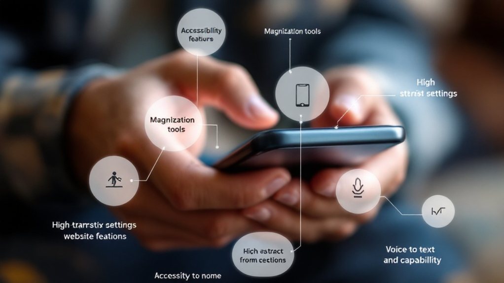
Alongside optimizing your mobile navigation, harnessing assistive technologies can amplify the accessibility of your website. Integrate screen readers, which convert text to speech, enabling users with visual impairments to navigate your site. Leverage alt-text and captions to describe visual content for those with limited sight. Ensure your code is compatible with keyboard-only navigation, catering to users who can't use a mouse. Implement high-contrast modes and adjustable font sizes to accommodate diverse needs. By embracing these assistive technologies, you'll create a truly inclusive mobile experience, empowering all users to access your website with ease.
Color Contrast and Readability

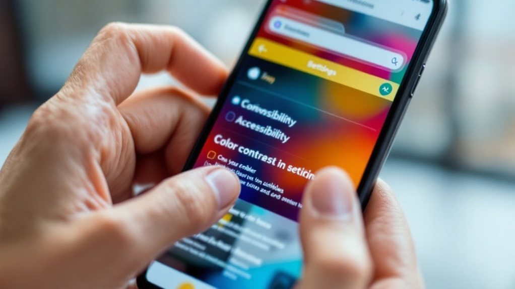
While optimizing color contrast and text readability may seem like a minor consideration, it's a critical component of mobile accessibility. Users with visual impairments, like low vision or color blindness, rely on high-contrast designs and legible typography to access your content. Ensure your text stands out clearly against the background, and avoid color combinations that are difficult to read. Use tools like WebAIM's Color Contrast Checker to validate your choices. Additionally, pay attention to font size, spacing, and weight – these factors significantly impact readability on small screens. By prioritizing color and text, you'll create a more inclusive mobile experience for all your users.
Captions and Transcripts for Multimedia
Don't overlook the importance of captions and transcripts for any multimedia content on your mobile site. They ensure your videos and audio are accessible to users who are deaf, hard of hearing, or prefer to consume content silently. Captions provide on-screen text that syncs with the spoken dialogue, while transcripts offer a complete textual representation. Both enhance comprehension and engagement for a broader audience. Implement captions and transcripts proactively, as they improve the user experience and demonstrate your commitment to inclusive design. Leverage automated tools to generate initial versions, then refine them manually for accuracy. Captioning and transcripts are essential for meeting accessibility guidelines and ensuring your mobile content is truly inclusive.

