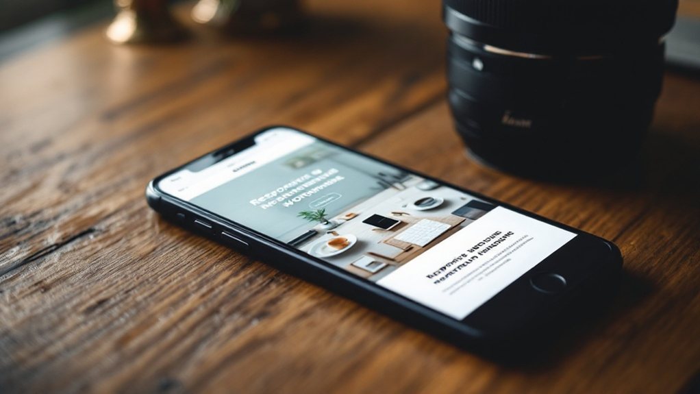
To create a mobile-friendly WordPress design, you'll want to focus on responsive optimization, prioritizing essential mobile content and navigation, streamlining site structure and performance, leveraging adaptive media, and integrating mobile-friendly plugins and themes. These strategies will ensure your website delivers an exceptional user experience across all devices, boosting engagement, conversions, and search rankings. Dive deeper to uncover more details on each of these key elements for crafting a truly mobile-centric WordPress presence.
Key Takeaways
- Choose a responsive WordPress theme that automatically adapts to different screen sizes and devices.
- Leverage mobile-friendly plugins like WPtouch, AMP, or Jetpack to enhance the mobile experience.
- Optimize images, videos, and other media by compressing files and using responsive sizing.
- Simplify navigation with mobile-centric menus, such as off-canvas or hamburger-style designs.
- Conduct regular performance audits and implement best practices for mobile-friendly website structure and speed.
Responsive Design Optimization

Why is responsive design optimization crucial for your WordPress website? With more people accessing the internet via mobile devices, having a mobile-friendly website is no longer optional – it's a necessity. Responsive design optimization ensures your website adapts seamlessly to different screen sizes, providing an optimal user experience across all devices. This not only improves engagement and reduces bounce rates, but it also boosts your search engine rankings, as Google prioritizes mobile-friendly websites. By optimizing your WordPress website's responsiveness, you'll enhance accessibility, improve conversions, and stay ahead of the competition in today's mobile-first world.
Mobile-Specific Content and Navigation
When optimizing your WordPress website for mobile, it's crucial to consider your content and navigation. Streamline your content, prioritizing the most essential information. Use shorter paragraphs, bullet points, and clear headings to enhance readability on smaller screens. Ensure your navigation is intuitive and easy to use on mobile devices. Simplify your menu structure, and consider implementing a responsive hamburger menu or off-canvas navigation. Leverage features like sticky headers and footer menus to provide quick access to key pages. Additionally, optimize your images and media for mobile by compressing files and using responsive image sizes. By tailoring your content and navigation to mobile users, you'll create a seamless and engaging experience across all devices.
Streamlining Website Structure and Performance

Beyond optimizing your content and navigation, streamlining your website's structure and performance is crucial for providing a seamless mobile experience. Ensure your site's architecture is clean and intuitive, with a logical flow that's easy to navigate. Minimize redirects, eliminate unnecessary plugins, and optimize images and other media to boost loading speeds. Leverage browser caching, content delivery networks, and other performance-enhancing techniques to deliver lightning-fast page loads, even on mobile. Additionally, regularly audit your site's structure and address any issues to maintain peak efficiency. By prioritizing structure and performance, you'll create a mobile-friendly WordPress experience that delights your users.
Leveraging Adaptive Images and Galleries
Optimizing images and galleries is a critical step in creating a mobile-friendly WordPress site. Leverage adaptive images that automatically adjust their size and resolution based on the user's device. This ensures fast load times and a seamless experience, whether they're on a desktop or a smartphone. Implement responsive galleries that stack or adjust the layout for smaller screens. Optimize file sizes and use next-gen image formats like WebP to further boost performance. Pair these strategies with lazy loading to only load media when it's needed, and you'll have a site that looks great and loads lightning-fast on any device. These techniques are essential for delivering an exceptional mobile experience.
Integrating Mobile-Friendly Plugins and Themes

Integrating mobile-friendly plugins and themes is a critical next step in crafting a WordPress site that performs exceptionally well on small screens. Look for lightweight, responsive themes that prioritize speed and usability on mobile devices. Likewise, explore plugins designed to optimize images, streamline navigation, and enhance the overall mobile experience. Ensure these elements work cohesively to create a seamless, engaging interface for your users, regardless of the device they're using. By carefully selecting mobile-centric plugins and themes, you'll elevate your WordPress site's accessibility and stay ahead of the curve in today's mobile-dominated landscape.
