To design a mobile-first e-commerce layout, prioritize a minimalist and clean design, optimize for seamless navigation, and leverage intuitive touch-based interactions. Streamline the checkout process, enhance product presentation, and incorporate contextual search functionality. Enable seamless cross-device experiences and optimize for lightning-fast loading times. Continuously test and iterate to ensure an engaging and conversion-optimized mobile shopping experience. Want to dive deeper into these essential tips?
Key Takeaways
- Prioritize a minimalist and clean design by using white space strategically and limiting the color palette and typography.
- Ensure seamless navigation by placing essential elements at the top, organizing products into clear categories, and providing intuitive gestures.
- Incorporate intuitive touch-based interactions with large, easy-to-tap buttons and icons, and leverage gestures like swiping, pinching, and tapping.
- Streamline the checkout process by eliminating unnecessary steps, autofilling customer info, and optimizing for one-handed use.
- Optimize product presentation with high-quality images, intuitive navigation, strategic use of white space, and concise, informative product descriptions.
Prioritize a Minimalist and Clean Design

When designing mobile-first e-commerce layouts, you'll want to prioritize a minimalist and clean design. This approach ensures your products and content shine, without distractions. Streamline the layout, using white space strategically to guide the user's eye. Opt for a limited color palette and simple typography that's easy to read on the go. Avoid clutter and unnecessary elements that could slow down load times or overwhelm mobile users. Instead, focus on the essentials – product images, descriptions, and a seamless purchasing process. This minimalist approach creates a polished, professional look that builds trust and encourages conversions. By putting the customer experience first, you'll create a mobile-friendly e-commerce site that resonates with your audience.
Optimize for Seamless Navigation
To optimize for seamless navigation, you'll want to structure your mobile e-commerce layout in a user-friendly way. Place essential elements, like the search bar and shopping cart, at the top of the page for easy access. Organize products into clear categories and subcategories, making it simple for customers to find what they need. Leverage intuitive gestures, like swiping and tapping, to allow smooth navigation between pages. Ensure your menu is concise and easy to navigate, with clear labeling and a hamburger icon for collapsing. Finally, provide breadcrumbs and back buttons to help users retrace their steps. By prioritizing seamless navigation, you'll enhance the overall user experience and drive increased conversions.
Leverage Intuitive Touch-Based Interactions

As you optimize your mobile e-commerce layout, it's crucial to leverage intuitive touch-based interactions. Incorporate large, easy-to-tap buttons and icons that respond quickly to user input. Ensure that navigation menus, product details, and checkout processes are designed for seamless touch interactions. Avoid small, cramped elements that are difficult to manipulate on a mobile screen. Leverage gestures like swiping, pinching, and tapping to create a fluid, natural experience. Prioritize instant feedback and responsiveness to build user trust and confidence. By prioritizing touch-based interactions, you'll create a mobile shopping experience that feels intuitive and effortless, driving higher engagement and conversions.
Streamline the Checkout Process
Streamlining the checkout process is key to driving higher mobile conversions. Eliminate unnecessary steps, autofill customer info, and allow payment via digital wallets. Provide a clear progress indicator so users know where they are in the checkout flow. Optimize for one-handed use by placing key actions within thumb reach. Minimize form fields and enable mobile-friendly input types like date pickers. Offer guest checkout to reduce friction. Clearly communicate shipping options and costs upfront. Leverage quick checkout buttons and avoid forcing account creation. Finally, test and optimize the checkout on real mobile devices to ensure a seamless experience.
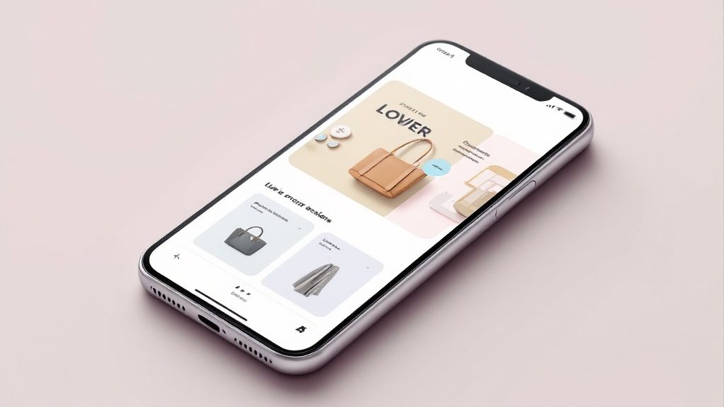
Enhance Product Presentation

Effective product presentation is paramount on mobile e-commerce sites. Leverage high-quality, visually-striking images that showcase your products from multiple angles. Utilize zoom capabilities to allow customers to inspect details up close. Present products in a clean, uncluttered layout, avoiding visual distractions. Implement intuitive navigation that makes it easy for users to browse your catalog. Strategically use white space to draw attention to key product features. Optimize image sizes to ensure fast load times, as slow-loading pages can deter mobile shoppers. Provide concise, informative product descriptions that highlight unique selling points. Leverage user-generated content, such as reviews and social media shares, to build trust and credibility.
Implement Responsive Images and Videos
While optimizing your website's visuals is crucial for mobile shoppers, you must also consider how images and videos appear across various devices and screen sizes. Implement responsive images and videos to ensure they adapt seamlessly. Use fluid-width properties and max-width to make them scalable. Leverage the 'srcset' and 'sizes' attributes to serve the appropriate image file based on the user's device. For videos, utilize the responsive '
Incorporate Contextual Search Functionality

How can you incorporate contextual search functionality to enhance your e-commerce layout for mobile users? Offer a search bar that anticipates users' intents based on their location, browsing history, and current context. This intelligent search feature should surface relevant products and content, streamlining the shopping experience. Leverage predictive search algorithms to provide autocomplete suggestions and related queries, guiding users towards their desired items. Ensure the search bar is prominently placed and optimized for touch-based input. Complement the search functionality with filtered navigation, allowing users to refine results by categories, price, and other attributes. By delivering a personalized, context-aware search experience, you'll boost engagement and conversions on your mobile e-commerce platform.
Enable Seamless Cross-Device Experiences
As mobile users increasingly switch between devices, it's crucial to enable seamless cross-device experiences that maintain continuity and consistency. Implement technologies like cloud-synced shopping carts, login credentials, and browsing histories to ensure customers can pick up where they left off, regardless of the device. Leverage responsive design to provide a cohesive look and feel across all touchpoints, optimizing content and functionality for each screen size. Further, utilize push notifications and email to guide customers through their journey, reinforcing brand identity and encouraging conversions. By prioritizing cross-device experiences, you'll cater to modern shopping habits and elevate customer satisfaction.
Optimize for Lightning-Fast Loading Times

Why is optimizing for lightning-fast loading times so crucial in today's fast-paced, mobile-driven e-commerce landscape? Online shoppers demand instant gratification – if your site takes too long to load, they'll abandon it in a heartbeat. Prioritize performance by minimizing file sizes, leveraging caching, and implementing lazy loading. Compress images, concatenate CSS/JS files, and enable browser caching. Serve content from a CDN to reduce latency. Leverage AMP or PWA technologies for near-instant load times. Monitor site speed and continually optimize. Lightning-fast loading is a must-have for any successful mobile-first e-commerce experience. Streamline every element, and you'll keep customers engaged and coming back.
Continuously Test and Iterate
Continuous testing and iteration are paramount in the mobile-first e-commerce landscape. You must constantly assess your layouts, measure user engagement, and make data-driven adjustments. Leverage A/B testing to experiment with different designs, features, and flows. Analyze performance metrics like bounce rate, conversion rate, and average time on page to identify areas for improvement. Be agile and adaptable, as mobile user preferences and behaviors are ever-evolving. Continuously optimize your layouts to deliver a seamless, intuitive experience. Embrace an iterative mindset – there's always room for refinement. Solicit user feedback, monitor industry trends, and stay ahead of the curve. Mastering the art of continuous testing and iteration is the key to mobile-first e-commerce success.
