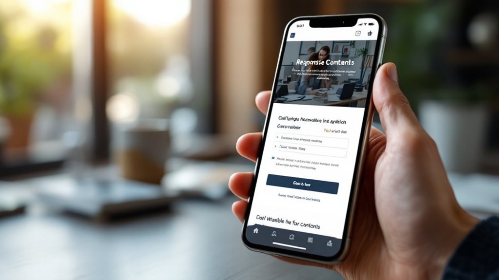
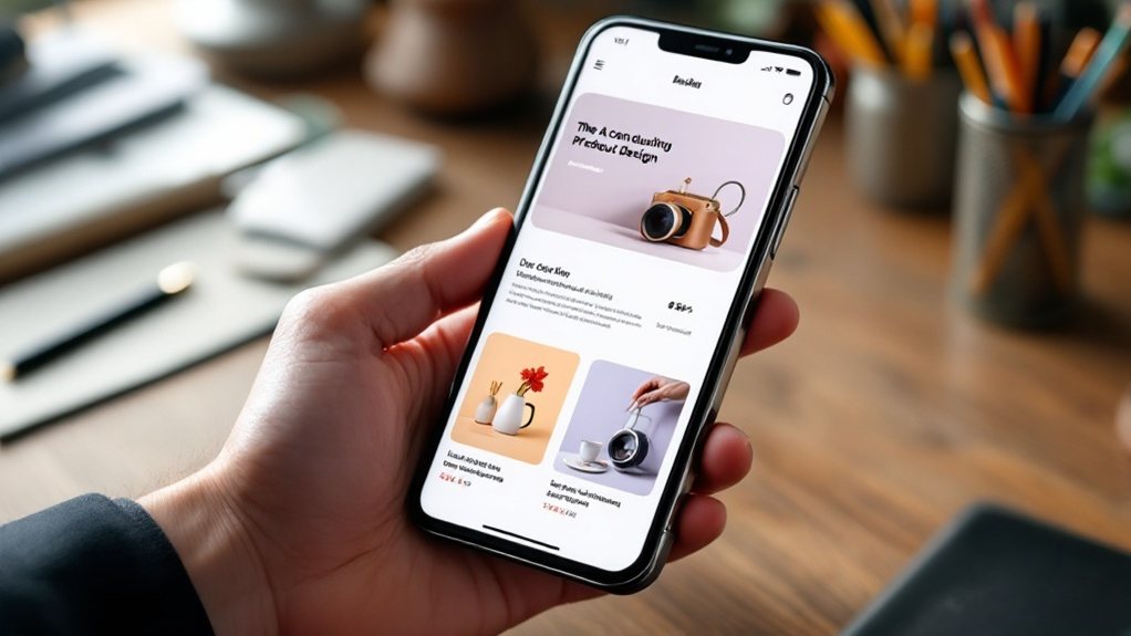
To deliver an exceptional mobile experience, prioritize a mobile-first design approach. Optimize for small screens by leveraging responsive techniques, streamline navigation, and enhance content presentation. Ensure your website is future-proof with fluid layouts that seamlessly adapt across devices. Integrating intuitive touch interactions and fast-loading performance will further elevate your mobile-centric strategy. Dive deeper to discover how you can transform your business's digital presence and captivate your on-the-go audience.
Key Takeaways
- Adopt a mobile-first approach to prioritize the mobile user experience and deliver a streamlined, intuitive interface that adapts seamlessly across devices.
- Leverage responsive design techniques to optimize content and layout for varying screen sizes, prioritizing the most important information and functionality.
- Implement fluid layouts using proportional units to enhance adaptability and future-proof the website, ensuring a consistent brand experience across touchpoints.
- Simplify navigation and user interface by decluttering, leveraging progressive disclosure, and making core actions and information easily accessible on mobile.
- Present content in a clean, scannable format optimized for mobile attention spans, incorporating visuals and prominent calls-to-action to drive deeper engagement.
Understanding the Mobile-First Approach

Although mobile devices have become ubiquitous, the mobile-first approach is more than just optimizing for smaller screens. It's a mindset that prioritizes the mobile user experience from the start. By designing for mobile constraints like limited screen real estate and connectivity, you can create a streamlined, intuitive interface that translates seamlessly to larger screens. This approach encourages you to focus on the essentials, eliminate clutter, and deliver the most crucial information and functionality. Mobile-first design ultimately benefits all users, as the simplified layout and enhanced usability enhance the experience across devices. Embracing this strategy helps you stay ahead of the curve and deliver a cohesive, user-centric web presence.
Optimizing for Small Screens and Varying Resolutions
With limited screen real estate on mobile devices, optimizing your web design for small screens is essential. Leverage responsive design techniques to ensure your content and layout adapt seamlessly across various device sizes. Prioritize the most important information and functionality, simplifying navigation and user interactions. Employ a mobile-first mindset, designing for the smallest screen first, then scaling up. Optimize visual elements like images and videos to load quickly and display clearly on mobile. Avoid complex layouts and heavy, uncompressed media that can bog down performance. Regularly test your design on a range of devices to identify and address any usability or technical issues. By prioritizing mobile optimization, you'll provide a smooth, engaging experience for your users.
Prioritizing Responsive Design and Fluid Layouts

Responsive design and fluid layouts should be at the forefront of your mobile-centric web design strategy. These approaches ensure your website adapts seamlessly to various screen sizes and devices, providing an optimal user experience. By prioritizing responsive design, you can create a single, flexible site that automatically adjusts its layout, content, and functionality to the user's device. Fluid layouts, which use proportional units like percentages instead of fixed pixel values, further enhance this adaptability. Embracing these strategies allows you to future-proof your website, catering to the ever-evolving mobile landscape. Invest in responsive and fluid design to deliver a consistent, high-quality experience across all touchpoints, strengthening your brand's mobile presence.
Streamlining Navigation and User Experience
How can you streamline navigation and user experience on your mobile-centric website? Start by prioritizing a simple, intuitive menu structure that's easy to access and understand on smaller screens. Declutter the interface, focusing on core actions and information users need most. Leverage progressive disclosure to hide less-essential content, revealing it only when necessary. Ensure navigation is thumb-friendly, with buttons and links spaced apart to prevent accidental taps. Analyze user data to identify pain points and optimize the flow. Incorporate gestures like swiping and pinch-to-zoom to enhance interactions. By streamlining your mobile navigation and UX, you can boost engagement, conversions, and overall satisfaction.
Enhancing Mobile-Friendly Content Presentation

Ensuring your content is optimized for mobile viewing is crucial to providing an engaging user experience. Prioritize clean, scannable layouts that make it easy for users to find and consume information on-the-go. Utilize responsive design techniques to ensure your content seamlessly adapts to various screen sizes. Leverage visuals, such as high-quality images and concise videos, to break up text and capture attention. Optimize content length and structure for mobile attention spans. Implement intuitive navigation, with prominent calls-to-action and clear pathways for deeper engagement. By enhancing mobile-friendly content presentation, you'll deliver a delightful experience that keeps users engaged and coming back.
Leveraging Intuitive Touch-Based Interactions
Enhancing the mobile experience goes beyond responsive layouts. Leverage intuitive touch-based interactions to captivate your users. Implement gesture-driven navigation, allowing effortless scrolling, swiping, and tapping. Ensure UI elements are optimized for touch, with ample spacing and clear affordances. Embrace micro-interactions, like smooth animations and haptic feedback, to provide a delightful tactile experience. Streamline data entry with virtual keyboards and autofill features. Leverage device sensors, like accelerometers and gyroscopes, to enable innovative interactions, such as tilt-based controls or device orientation-based content display. Prioritize a seamless, intuitive mobile experience to keep your users engaged and satisfied.
Ensuring Fast-Loading and Efficient Mobile Performance

Mobile performance is crucial for delivering an exceptional user experience. Ensure your website loads swiftly, regardless of the user's device or network conditions. Leverage techniques like image optimization, minification, and content delivery networks to minimize file sizes and reduce server response times. Prioritize above-the-fold content, using progressive web app strategies to deliver a fast-loading initial experience. Monitor and optimize your website's performance metrics, such as time to first byte and first contentful paint, to identify and address bottlenecks. Invest in a mobile-first development approach, designing for performance from the ground up. By prioritizing mobile performance, you'll captivate your audience and outpace your competition.
Integrating Seamless Cross-Device Compatibility
While mobile performance is essential, you must also consider how your website seamlessly integrates across devices. Ensure a consistent user experience regardless of the platform, be it desktop, tablet, or smartphone. Leverage responsive web design techniques to create a layout that adapts elegantly to various screen sizes. Optimize content, images, and media to load quickly on any device. Implement progressive web app (PWA) features to provide offline access and app-like functionality. Analyze user behavior and browsing patterns to identify pain points in the cross-device journey. Continually test and iterate your design to deliver a cohesive, seamless experience that delights users across all touchpoints.
Implementing Continuous Testing and Optimization

To ensure your mobile-centric web design effectively meets user needs, you'll need to implement continuous testing and optimization. Regularly evaluate your website's performance across various devices and screen sizes, analyzing metrics like page load times, bounce rates, and user engagement. Leverage A/B testing to identify the most effective design elements and content. Continuously optimize your site's layout, navigation, and functionality based on user feedback and data-driven insights. This iterative process will help you refine your mobile-centric approach, ensuring a seamless and satisfactory user experience. Stay ahead of evolving trends and user expectations by making ongoing improvements to your mobile-first web design strategy.

