With mobile devices accounting for over 60% of global web traffic, designing for mobile first is no longer optional but essential. Mobile-first web design represents a fundamental shift in how we approach creating digital experiences, prioritizing the constraints and opportunities of smaller screens before scaling up to larger displays. This methodology ensures your website delivers exceptional experiences regardless of how users choose to access it.
Key Takeaways
- Mobile-first design starts with the smallest screen and progressively enhances for larger devices, ensuring optimal experiences across all platforms.
- Touch-friendly navigation with adequately sized tap targets and intuitive gestures improves usability on mobile devices.
- Performance optimization is critical for mobile users who often face slower connections and limited data plans.
- Content prioritization forces you to focus on what truly matters, resulting in cleaner, more effective designs across all screen sizes.
- Testing across real devices and diverse network conditions ensures your mobile experience meets actual user expectations.
Understanding the Mobile-First Philosophy

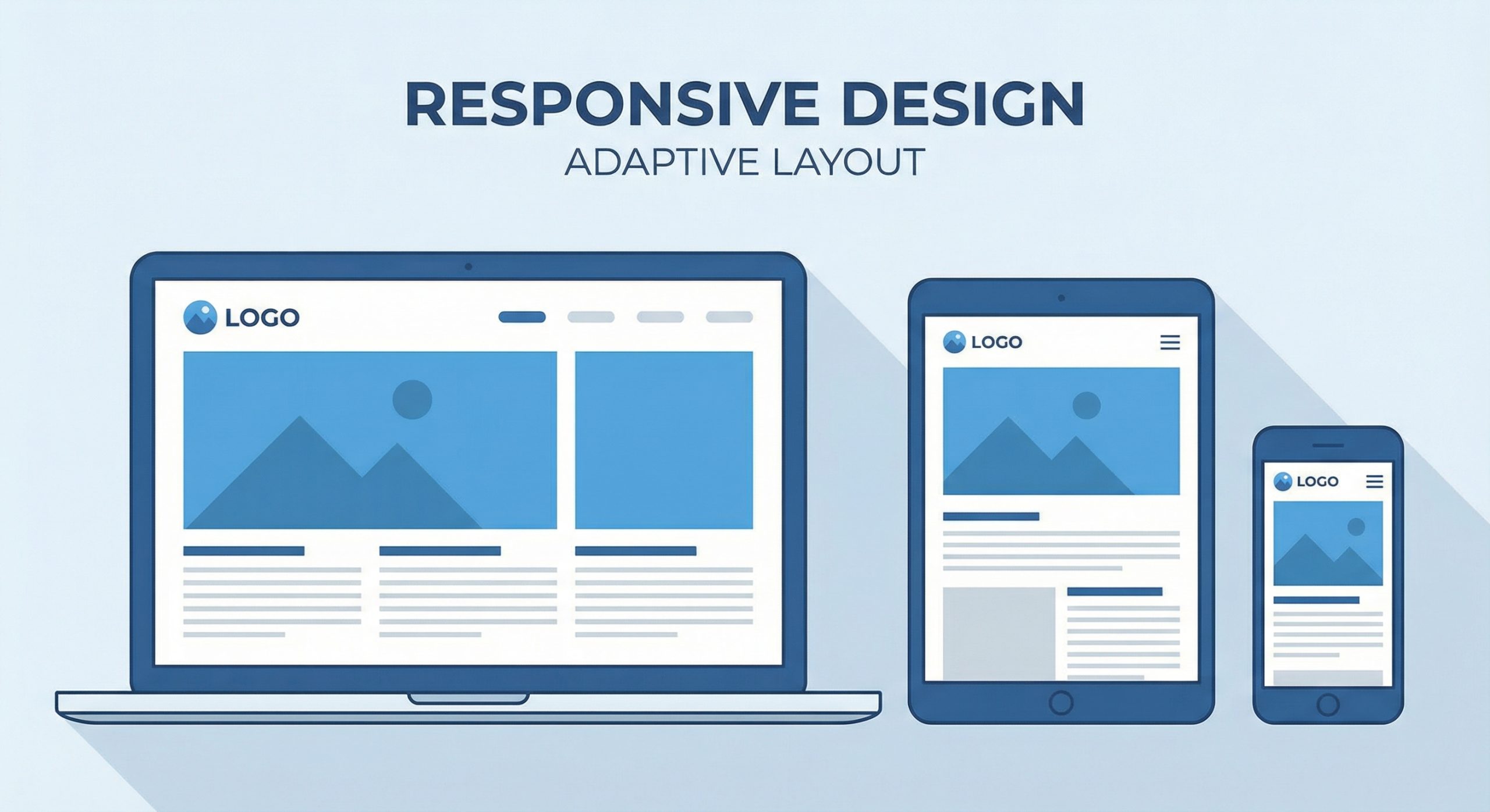
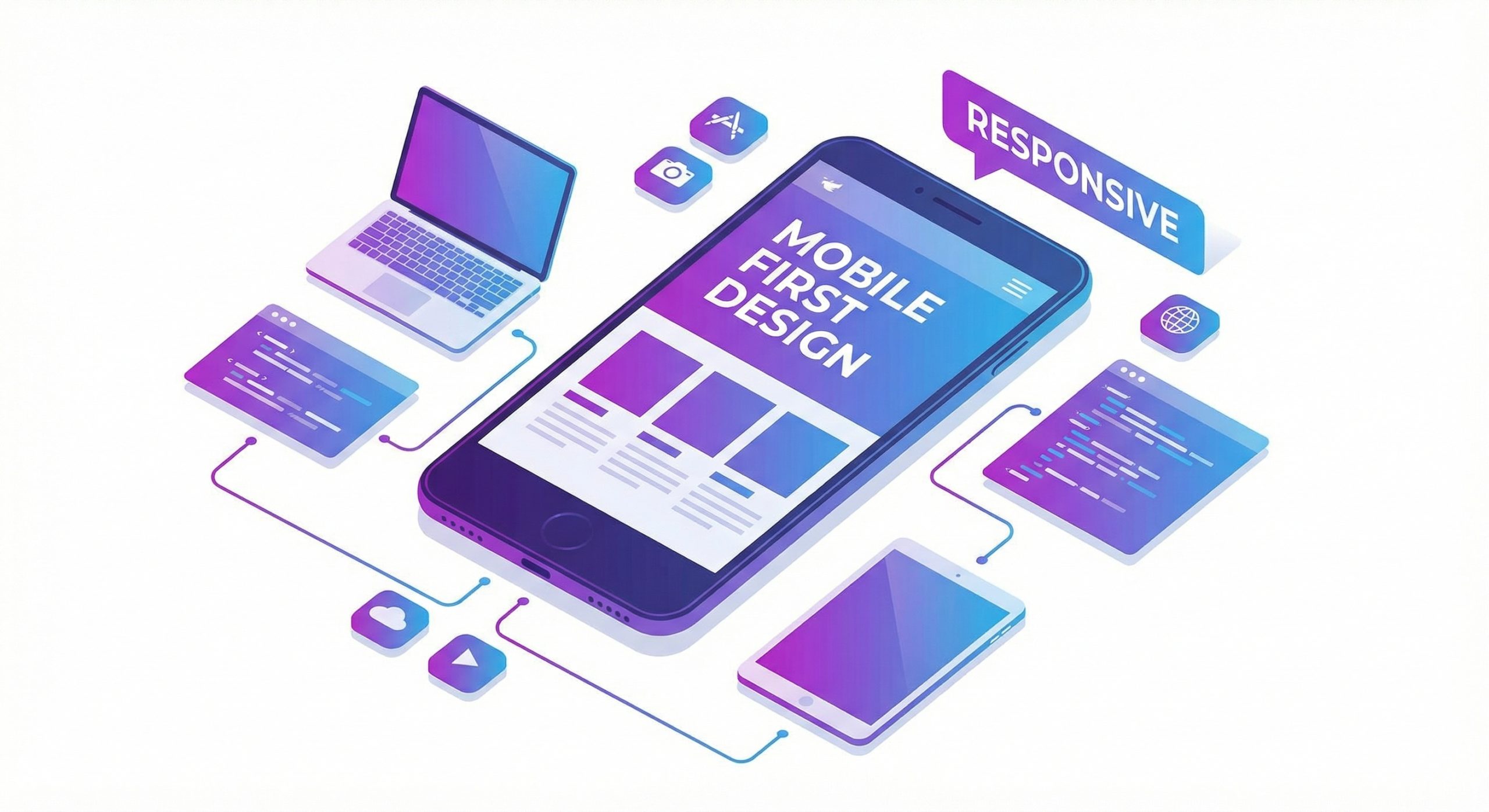
Mobile-first design reverses the traditional approach of designing for desktop and then adapting for mobile. Instead, it starts with the most constrained environment and progressively enhances the experience as screen real estate increases. This approach emerged from the recognition that mobile constraints actually lead to better design decisions, forcing designers to prioritize content and functionality ruthlessly.
The benefits extend beyond simply having a functional mobile site. When you design for mobile first, you naturally create faster, more focused experiences. Limited screen space demands clarity, forcing you to eliminate unnecessary elements and streamline user journeys. These improvements cascade upward, resulting in desktop experiences that are equally clean and purpose-driven.
From a technical standpoint, mobile-first CSS uses min-width media queries rather than max-width. Base styles target mobile devices, with media queries adding complexity for larger screens. This approach also typically results in smaller CSS files and better performance, as mobile devices receive only the styles they need without downloading desktop-specific code.
Designing Touch-Friendly Interfaces

Touch interfaces fundamentally differ from mouse-based interactions. Fingers are less precise than cursors, and users interact with screens using various grips and orientations. Successful mobile design accounts for these realities by providing adequately sized touch targets, typically at least 44 pixels square as recommended by Apple’s Human Interface Guidelines.
Navigation patterns require special attention on mobile devices. Hamburger menus, while space-efficient, can hide important options and require additional taps. Consider alternatives like bottom navigation bars for frequently accessed sections, which keep key functions within easy thumb reach. Sticky headers with essential navigation elements provide constant access without consuming valuable screen space.
Form design presents unique challenges on mobile. Use appropriate input types to trigger specialized keyboards for email, phone numbers, and URLs. Implement autocomplete where appropriate and minimize required fields. Consider breaking longer forms into multiple steps to prevent overwhelming users with cluttered screens. Clear validation messages and helpful error recovery prevent frustration when users make mistakes.
Performance Optimization for Mobile Users

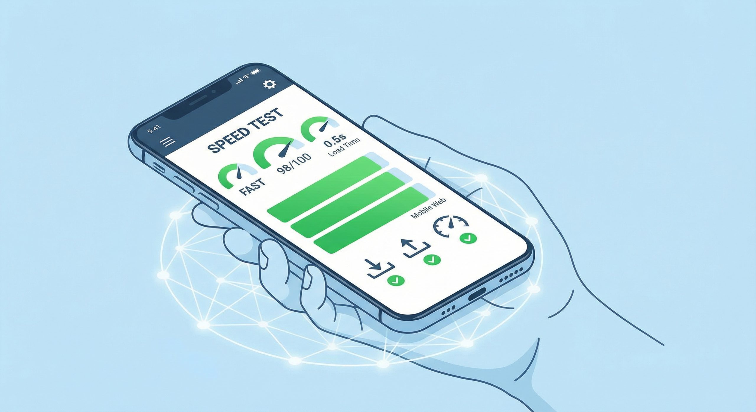
Mobile users often access websites on cellular connections with varying quality and speed. Research shows that 53% of mobile users abandon sites that take longer than 3 seconds to load. Performance optimization is therefore not just a technical concern but a critical business requirement that directly impacts engagement and conversions.
Image optimization offers significant performance gains for mobile users. Serve appropriately sized images based on device capabilities using responsive images with srcset. Modern formats like WebP provide substantial file size reductions without quality loss. Lazy loading defers off-screen images until users scroll toward them, accelerating initial page loads and conserving mobile data.
Minimize JavaScript payloads through code splitting and tree shaking. Only load scripts necessary for current page functionality, deferring others until needed. Consider the cost of third-party scripts, which often contribute significantly to page weight. Each library, widget, and tracker adds to download times and processing overhead that mobile devices feel more acutely than their desktop counterparts.
Content Strategy for Mobile Experiences
Mobile screens demand focused content hierarchies. Users scanning on small screens need to quickly identify relevant information without excessive scrolling or searching. Structure content with clear headings, short paragraphs, and bulleted lists that facilitate scanning. Front-load important information rather than burying it within lengthy text blocks.
Consider how content consumption differs on mobile devices. Users often browse in short sessions during commutes, waiting periods, or breaks. Design for these micro-moments by providing quick answers and clear paths to deeper content when users have more time. Collapsible sections, tabbed content, and progressive disclosure techniques help manage information density without overwhelming users.
Media content requires particular attention. Videos should be optimized for mobile playback with appropriate encoding settings and consider data consumption. Auto-playing videos can frustrate users on limited data plans. Provide clear controls and consider offering multiple quality options. Images should maintain their impact at smaller sizes, which may require different crops or compositions than desktop versions.
Testing and Validation Across Devices

Browser developer tools provide excellent starting points for mobile testing, with device emulation modes that simulate various screen sizes and pixel densities. However, emulation cannot fully replicate the experience of using actual devices. Touch interactions, real-world performance, and native browser behaviors often differ from simulated environments.
Maintain a testing device library covering major operating systems and screen sizes. At minimum, test on recent iPhone and Android devices, including both phones and tablets. Pay attention to different browser engines, as Safari on iOS and Chrome on Android may render elements differently. Budget Android devices reveal performance issues that may not appear on flagship devices.
Test under realistic network conditions. Chrome DevTools allows throttling to simulate 3G or slower connections, revealing performance issues hidden on fast development networks. Real-world testing should include scenarios like underground transit, elevators, and other locations where connectivity varies. Users in these situations form lasting impressions of your site’s reliability.
Future-Proofing Your Mobile Strategy
The mobile landscape continues evolving rapidly. Foldable devices introduce new form factors that challenge traditional responsive breakpoints. Voice interfaces and gesture controls offer alternative interaction modes. Progressive Web Apps blur the line between websites and native applications, offering offline capabilities and home screen installation.
Stay current with emerging standards and best practices. Web platform features like scroll-driven animations, container queries, and improved form controls continuously enhance what’s possible on mobile devices. Regular audits using tools like Lighthouse identify optimization opportunities and ensure compliance with evolving best practices.
Building a successful mobile-first strategy requires ongoing commitment. User expectations rise as top-tier experiences set new standards. Continuous monitoring, testing, and iteration ensure your mobile presence remains competitive. The investment in mobile excellence pays dividends through higher engagement, better conversions, and stronger relationships with an increasingly mobile-centric audience.

