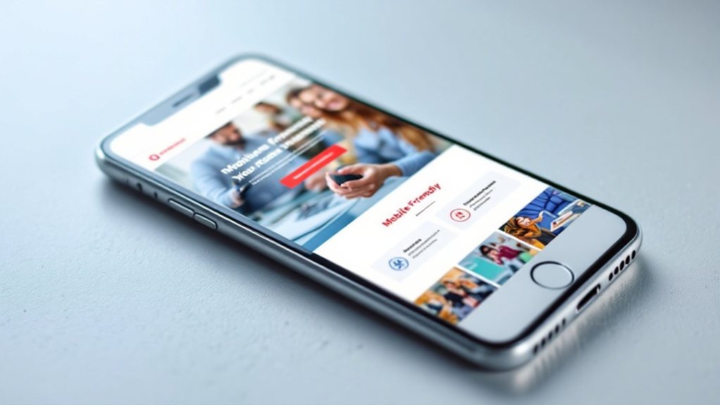
Mobile-friendly web design is essential for your business's success. It boosts user engagement, improves accessibility and usability, enhances your search engine optimization, elevates your brand reputation, and increases your conversion rates. With a seamless cross-device experience, mobile optimization is cost-effective and gives you a competitive edge in the market – setting you up for long-term growth. To learn more about how mobile-friendly design can transform your business, keep reading.
Key Takeaways
- Mobile-friendly web design leads to higher user engagement, increasing the likelihood of content exploration, sharing, and conversion.
- Responsive layouts and intuitive navigation provide a seamless user experience across devices, improving accessibility and meeting customer expectations.
- Mobile optimization boosts search engine rankings, driving more qualified leads and improving overall business outcomes.
- A mobile-friendly design demonstrates a commitment to user experience, enhancing brand reputation and credibility.
- Mobile-friendly websites enjoy up to 160% higher conversion rates compared to non-optimized sites, unlocking greater returns on digital marketing efforts.
Increased User Engagement

With a mobile-friendly web design, you can expect increased user engagement. When your website is optimized for mobile, users can easily navigate and interact with your content, leading to higher engagement rates. They'll be more likely to explore your products or services, share your content, and convert into customers. A responsive design that adapts to different screen sizes ensures your audience has a seamless experience, whether they're browsing on a smartphone or a tablet. This enhanced engagement translates to greater brand awareness, stronger customer relationships, and ultimately, improved business outcomes. Investing in mobile-friendly web design is a strategic move that can drive meaningful results for your company.
Improved Accessibility and Usability
Optimizing your website for mobile devices doesn't just enhance user engagement – it also improves accessibility and usability. With a mobile-friendly design, your content and features become readily available on the go, catering to users' on-demand needs. Responsive layouts ensure a seamless experience across various screen sizes, while intuitive navigation and touch-friendly interfaces make it a breeze to explore your website. Improved accessibility means more users, including those with disabilities, can engage with your brand. By investing in mobile optimization, you're not only meeting customer expectations but also expanding your reach and boosting overall satisfaction.
Better Search Engine Optimization (SEO)

A mobile-friendly web design not only enhances user experience but also boosts your search engine optimization (SEO) efforts. Search engines like Google prioritize mobile-friendly websites, as they provide a better experience for mobile users who now account for the majority of online traffic. When your website is optimized for mobile, you'll see improved search rankings, increased visibility, and more qualified leads. Additionally, mobile-friendly sites load faster, which is another important ranking factor. By investing in a responsive, mobile-optimized website, you'll improve your online presence, attract more engaged visitors, and ultimately drive more business.
Enhanced Brand Reputation
Your mobile-friendly web design doesn't just boost your search rankings – it also enhances your brand's reputation. When customers can easily access your website on their smartphones, it demonstrates your commitment to providing a seamless, user-friendly experience. This, in turn, builds trust and credibility, as it shows you value your audience's needs. Additionally, a mobile-optimized site reflects professionalism and modernity, elevating your brand's image. Potential customers are more likely to perceive your business as reliable and tech-savvy, which can give you a competitive edge. Ultimately, a mobile-friendly web design contributes to a stronger, more reputable brand that resonates with your target audience.
Higher Conversion Rates

When your website is mobile-friendly, it can lead to higher conversion rates. Optimized for smartphones and tablets, a mobile-friendly design ensures your customers can easily navigate your site and complete their desired actions, whether that's making a purchase, signing up for a newsletter, or submitting a form. This seamless user experience boosts engagement and encourages visitors to convert. In fact, studies show mobile-friendly sites enjoy up to 160% higher conversion rates compared to non-mobile-friendly ones. By investing in a mobile-first approach, you can unlock these benefits and outperform competitors who neglect the mobile experience. With increased conversions, you'll see a stronger return on your digital marketing efforts and grow your business.
Reduced Bounce Rates
In addition to higher conversion rates, a mobile-friendly website can also significantly reduce your bounce rates. When users can easily navigate and interact with your site on their mobile devices, they're less likely to leave quickly. A responsive design ensures a seamless experience, keeping users engaged and interested in your content or offerings. This, in turn, lowers your bounce rate, a crucial metric that reflects the percentage of visitors who leave your site after viewing only one page. Reducing bounce rates not only boosts your search engine rankings but also indicates that your target audience finds your mobile site valuable and relevant. This can lead to increased customer loyalty, deeper brand engagement, and, ultimately, more profitable business outcomes.
Streamlined Content Consumption

Streamlining content consumption on a mobile-friendly website is crucial, as users often have limited time and attention spans when browsing on the go. By presenting content in a well-organized, easy-to-navigate format, you can encourage users to engage with your brand and convert more effectively. Concise, scannable sections, strategic use of headers and bullet points, and a clean, uncluttered design all contribute to a seamless mobile experience. Additionally, optimizing images and videos for quick loading times ensures users don't get frustrated and bounce. Ultimately, a streamlined, mobile-first approach to content allows your audience to quickly find and consume the information they need, boosting their satisfaction and your business outcomes.
Seamless Cross-Device Experience
As users seamlessly transition between devices, ensuring a consistent and intuitive experience across all platforms is paramount. A mobile-friendly website that effortlessly adapts to smartphones, tablets, and desktops demonstrates your commitment to user convenience. It allows customers to pick up where they left off, whether they're browsing your products on their commute or finalizing a purchase on their laptop. Optimizing for cross-device functionality, from responsive layouts to intuitive navigation, elevates your brand and fosters loyalty. Customers expect a frictionless digital journey, and a mobile-friendly design delivers just that, enabling them to engage with your business seamlessly across devices.
Cost-Effective Web Development

Web development costs can quickly escalate, but mobile-friendly design offers cost-effective solutions. Responsive web design ensures your site works seamlessly across devices, reducing the need for separate mobile and desktop versions. This single codebase approach saves time and resources during development and maintenance. Additionally, mobile optimization can enhance search engine visibility, driving more traffic without costly ad campaigns. Streamlined, mobile-first design also improves user experience, leading to higher engagement and conversion rates. While upfront investment may be required, the long-term benefits of mobile-friendly web design make it a wise, cost-effective choice for businesses of all sizes. It's an investment that pays dividends in the digital landscape.
Competitive Advantage in the Market
Beyond the cost-effective benefits, mobile-friendly web design can give your business a distinct competitive edge in the market. By offering a seamless and optimized browsing experience across all devices, you'll attract and retain more customers who expect a responsive and user-friendly website. In today's digital landscape, where attention spans are short and competition is fierce, having a mobile-friendly site can make all the difference. It enhances your brand's credibility, improves customer satisfaction, and boosts your discoverability on search engines. Ultimately, investing in mobile-friendly web design is a strategic move that can help you stay ahead of the curve and outshine your competitors.
Responsive Design for Future-Proofing

To future-proof your business, embracing responsive web design is essential. With the constant evolution of devices and screen sizes, a fixed-width website simply won't cut it. Responsive design ensures your website seamlessly adapts, providing an optimal experience for all users, whether they're on a desktop, tablet, or smartphone. This future-proofing approach means your website will remain accessible and engaging, even as new technologies emerge. Responsive design not only enhances the user experience but also boosts your search engine rankings, as Google prioritizes mobile-friendly websites. Investing in responsive web design is a smart move that will pay dividends for years to come, keeping your business ahead of the curve.
