As a small business owner, responsive web design is vital to staying competitive in the digital age. It ensures your website seamlessly adapts to any device, from desktops to smartphones, providing a smooth and engaging user experience. This not only boosts your online visibility and credibility but also reaches a wider audience and improves customer satisfaction. By implementing effective responsive design strategies, you'll set your small business up for success in the fast-paced digital world.
Key Takeaways
- Responsive web design ensures small business websites are accessible and engaging across devices, boosting user experience and online visibility.
- Mobile-first approach prioritizes the mobile user experience, leveraging flexible layouts and optimized content for seamless adaptation to various screen sizes.
- Rapid load times and optimized media assets create a smooth, consistent experience, enhancing customer satisfaction and driving higher conversion rates.
- Responsive design improves search engine rankings, as Google favors mobile-friendly websites, helping small businesses reach a wider audience.
- Measuring metrics like bounce rate, time on site, and conversions allows small businesses to quantify the impact of responsive design and continuously improve their online presence.
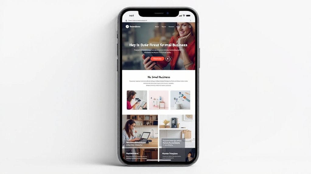
The Importance of Responsive Web Design for Small Businesses

In today's digital landscape, the significance of responsive web design for small businesses cannot be overstated. With more users accessing the internet on mobile devices, your website must adapt seamlessly to various screen sizes and resolutions. A responsive design ensures your content is easily accessible and engaging, regardless of the device used. This not only enhances the user experience but also boosts your online visibility and credibility. By optimizing your website for mobile, you can reach a wider audience, improve customer satisfaction, and stay ahead of the competition. Responsive web design is no longer a luxury but a necessity for small businesses looking to thrive in the digital era.
Key Principles of Responsive Web Design
Three key principles underpin effective responsive web design. First, adopt a mobile-first approach, prioritizing the mobile user experience and then enhancing for larger screens. Second, leverage flexible layouts and grids that can adapt to various viewport sizes. Third, optimize content and assets, compressing images and minimizing file sizes to ensure fast load times across devices. Adhering to these principles ensures your small business website delivers a seamless and high-performance experience, whether accessed on a smartphone, tablet, or desktop. Responsive design is no longer optional – it's essential for remaining competitive and meeting the expectations of today's tech-savvy consumers.
Optimizing the User Experience Across Devices

With a responsive design, you can optimize the user experience across a variety of devices. This means your website will adapt seamlessly to desktops, tablets, and smartphones, ensuring your customers can easily navigate and engage with your content regardless of the device they're using. By prioritizing key information and functionality, streamlining navigation, and optimizing media and loading times, you create a smooth, consistent experience that keeps users engaged and coming back. Responsive design also boosts your search engine visibility, as Google favors mobile-friendly sites. Investing in a responsive website is crucial for small businesses to stay competitive and meet the evolving needs of today's digital-savvy consumers.
Implementing Responsive Design Strategies
To implement responsive design strategies effectively, you'll need to consider several key elements. First, establish a mobile-first approach, designing your website to work seamlessly on smaller screens before addressing larger desktop layouts. Utilize flexible grids, images, and media queries to ensure your content adapts to different viewport sizes. Prioritize content and functionality, streamlining the user experience across devices. Optimize load times by compressing assets, leveraging browser caching, and minimizing redirects. Test your website extensively, verifying its responsiveness on a range of devices and browsers. By adopting these strategies, you can create a website that delivers a consistent, high-quality experience to your small business customers, regardless of the device they're using.
Measuring the Impact of Responsive Web Design

How do you measure the impact of responsive web design on your small business website? Tracking key metrics is crucial. Look at your website's bounce rate, time on site, and conversion rates. Has responsive design reduced bounce rates and increased engagement? Analyze data from before and after your responsive web design implementation. User feedback is also vital. Conduct surveys and interviews to understand how customers navigate and interact with your responsive site. Pay attention to their device usage and browsing behavior. Ultimately, the true measure of success is whether responsive design has improved your website's performance and your customers' experiences. With the right data, you can optimize your site and bolster your small business's online presence.
