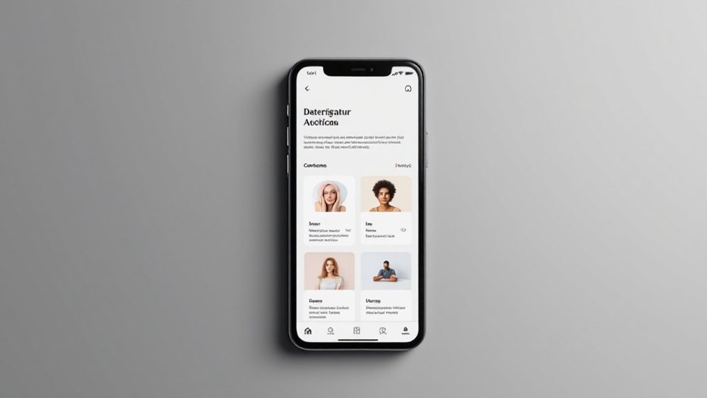
Simplify your menu structure, keeping it clear and uncluttered. Optimize touch interactions with appropriately sized links and buttons. Prioritize responsive design so your website adapts seamlessly across devices. Enhance scrolling and swipe functionality for a delightful mobile experience. Implement sticky navigation to streamline the user journey. Incorporate these user-friendly tips, and you'll create a corporate website that engages mobile visitors and keeps them coming back for more.
Key Takeaways
- Simplify the menu structure by limiting top-level menu items to 5-7 and organizing submenus logically to enhance clarity and ease of navigation.
- Optimize touch interactions by ensuring appropriately sized links and buttons with ample spacing, and incorporating gesture-based controls to streamline common navigation tasks.
- Prioritize responsive design to ensure the website adapts seamlessly to various screen sizes and devices, improving accessibility and search engine visibility.
- Enhance scrolling and swipe functionality to provide a smooth, intuitive user experience that feels natural and consistent across the site.
- Implement sticky navigation with the most important links to minimize the need for excessive scrolling or tapping, creating a seamless mobile experience.
Simplify the Menu Structure

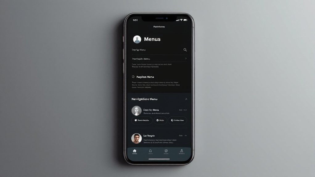
Although mobile navigation can quickly become complex, you can simplify the menu structure to enhance user-friendliness. Keep the primary navigation clear and uncluttered, with no more than 5-7 top-level menu items. Organize submenus logically, minimizing nested layers. Use intuitive labels that resonate with your audience. Prioritize the most essential functions and group related content. Leverage progressive disclosure to reveal additional options only when needed. Streamline the overall information architecture, making it easy for users to find what they're looking for. With a simplified, user-centric menu, you'll improve mobile navigation and drive higher engagement.
Optimize Touch Interactions
Now that you've simplified the menu structure, it's time to focus on optimizing the touch interactions for your mobile navigation. Ensure your links and buttons are appropriately sized for finger taps, with ample spacing between them. Avoid tiny, clustered elements that can be frustrating to select. Incorporate clear visual cues, like highlighting the active section, to help users navigate intuitively. Minimize the need for precise touch by making interactive elements larger and more forgiving. Additionally, consider incorporating gesture-based controls, such as swiping or pinching, to streamline common navigation tasks. By optimizing the touch experience, you'll enhance the overall usability of your mobile navigation, resulting in a more satisfying user experience.
Prioritize Responsive Design

When designing your mobile navigation, prioritizing responsive design is crucial. It ensures your website adapts seamlessly to various screen sizes and devices, providing an optimal user experience. Responsive design involves flexible layouts, images, and content that reshape dynamically. This eliminates the need for a separate mobile version, simplifying maintenance. Additionally, responsive websites rank higher in search engines, as Google favors mobile-friendly content. By prioritizing responsive design, you'll reach more users, boost engagement, and improve overall efficiency. Remember, in today's mobile-first world, a responsive navigation is no longer a nice-to-have – it's a must-have for any successful corporate website.
Enhance Scrolling and Swipe Functionality
With responsive design as the foundation, you can now focus on enhancing the scrolling and swipe functionality of your mobile navigation. Implement smooth, intuitive scrolling that responds seamlessly to user input. Leverage swipe gestures to enable quick navigation between pages or sections. Ensure that scrolling and swiping feel natural and consistent across your site. Optimize performance to avoid lag or choppiness, providing a delightful user experience. Remember, effortless navigation is key to engaging your mobile audience and driving higher conversions. By enhancing these core interactions, you'll create a mobile-first experience that keeps users coming back.
Implement Sticky Navigation

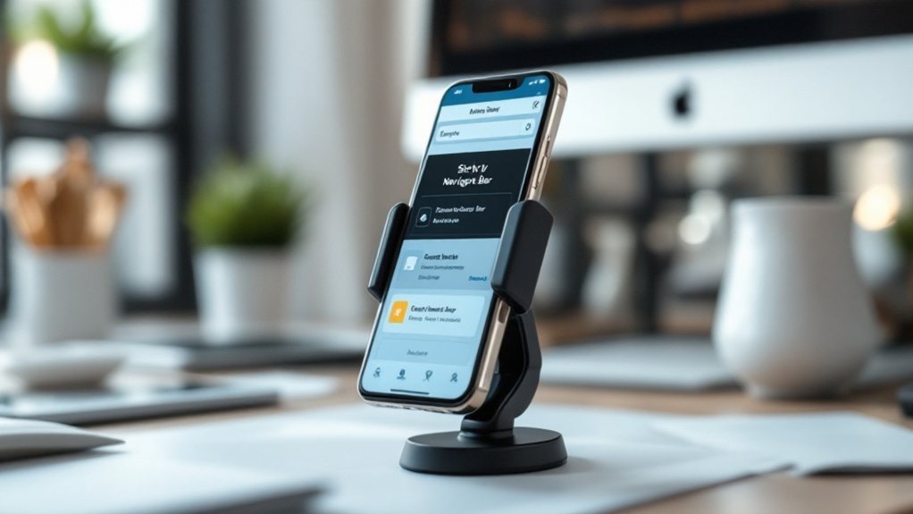
While responsive design and smooth scrolling are essential foundations, implementing a sticky navigation menu can take your mobile experience to new heights. A sticky nav bar remains fixed at the top of the screen as users scroll, ensuring quick access to key pages and functions. This enhances usability by minimizing the need for excessive scrolling or tapping. Strategically place your most important links in this sticky menu, streamlining the user journey. Consider incorporating subtle animations or effects to draw attention and highlight the nav's sticky nature. Pair this with a clean, intuitive menu structure for a seamless mobile navigation experience that keeps users engaged and productive.
Utilize Intuitive Search Capabilities
Providing intuitive search capabilities is pivotal for enhancing your mobile navigation. Ensure your search bar is prominently displayed and easy to access, allowing users to quickly find the information they need. Implement smart search features like autocomplete and predictive text to streamline the search process. Optimize your search algorithm to deliver relevant, accurate results, and consider incorporating filters to refine the search. Avoid cluttering the interface with unnecessary elements that could distract from the search experience. Monitor user behavior and feedback to continuously improve the search functionality, making it an integral part of your user-friendly mobile navigation strategy.
Provide Clear Calls-to-Action

Clear and prominent calls-to-action are integral to your user-friendly mobile navigation. They guide users to the actions you want them to take, whether it's signing up for a newsletter, making a purchase, or exploring your products. Ensure your CTAs are visually distinct, with contrasting colors and ample white space. Use action-oriented language that's concise and compelling. Place CTAs strategically, like at the end of content sections or in sticky headers. Test different CTA placements, wording, and designs to optimize their performance. Responsive design is crucial, so your CTAs look great and function seamlessly on mobile. With clear, impactful CTAs, you'll empower users to navigate your site and take desired actions.
Optimize for One-Handed Use
When designing for mobile, you must optimize your navigation for one-handed use. Ensure all key actions are within thumb's reach, as users often hold their phones with one hand. Organize menus and links logically, with the most essential functions at the bottom of the screen. Avoid long or cluttered layouts that require excessive scrolling or tapping. Leverage gestures like swipe and tap to enhance navigation efficiency. Provide ample target sizes for links and buttons, making them easy to select without accidentally triggering nearby elements. Test your design with real users to identify and address any pain points. Prioritize simplicity and ease of use to deliver a seamless mobile experience.
Incorporate Visual Hierarchy

To create a visually intuitive mobile navigation, you'll want to incorporate a clear visual hierarchy. This means arranging navigation elements based on their importance, with the most essential options prominently displayed. Use size, color, and spacing to draw the user's eye to primary actions. Minimize clutter by grouping related items together and hiding secondary options behind menus or toggles. Leverage visual cues like icons and labels to quickly communicate the function of each navigation element. This structured approach will guide users through your mobile site, reducing cognitive load and improving the overall experience.
Conduct Regular User Testing
Conducting regular user testing is crucial for validating your mobile navigation's effectiveness. It allows you to gather direct feedback from your target audience and identify areas for improvement. Don't rely solely on your own assumptions – observe how users interact with your navigation, note their pain points, and iterate accordingly. Make user testing a continuous process, not a one-time event. Leverage various testing methods, from in-person sessions to remote usability studies, to uncover insights. Remember, user behavior and preferences can evolve, so regularly engaging with your audience is key to maintaining a truly user-friendly mobile experience.

